Introduction
An interactive web page was created based on the design specifications with the intent to reproduce the workflow and content as closely as possible.
As such the following assets were used:
2D vector graphic files (SVG) and bitmap images exported from Figma. A tradeoff was determined if the size of SVGs was too large for image content.
Direct reference within HTML or Javascript.
3D assets created based on 2D references. Maya and Blender were used
3d geometry and animation are in industry standard glTF format
3d materials are in industry standard MaterialX format
Lighting was in the form of IBLs
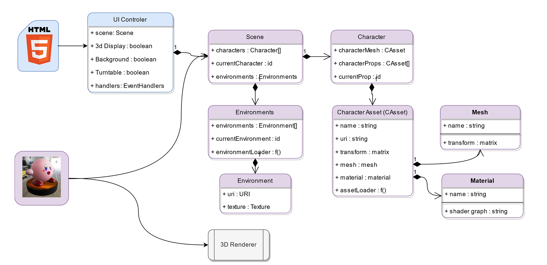
The additional new component which required a new implementation was a 3D viewer. This uses the Three.js library to render with.
2D Compositing/Layers
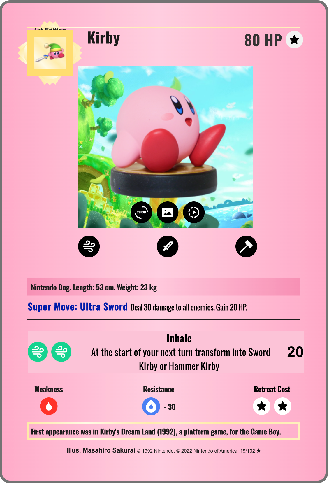
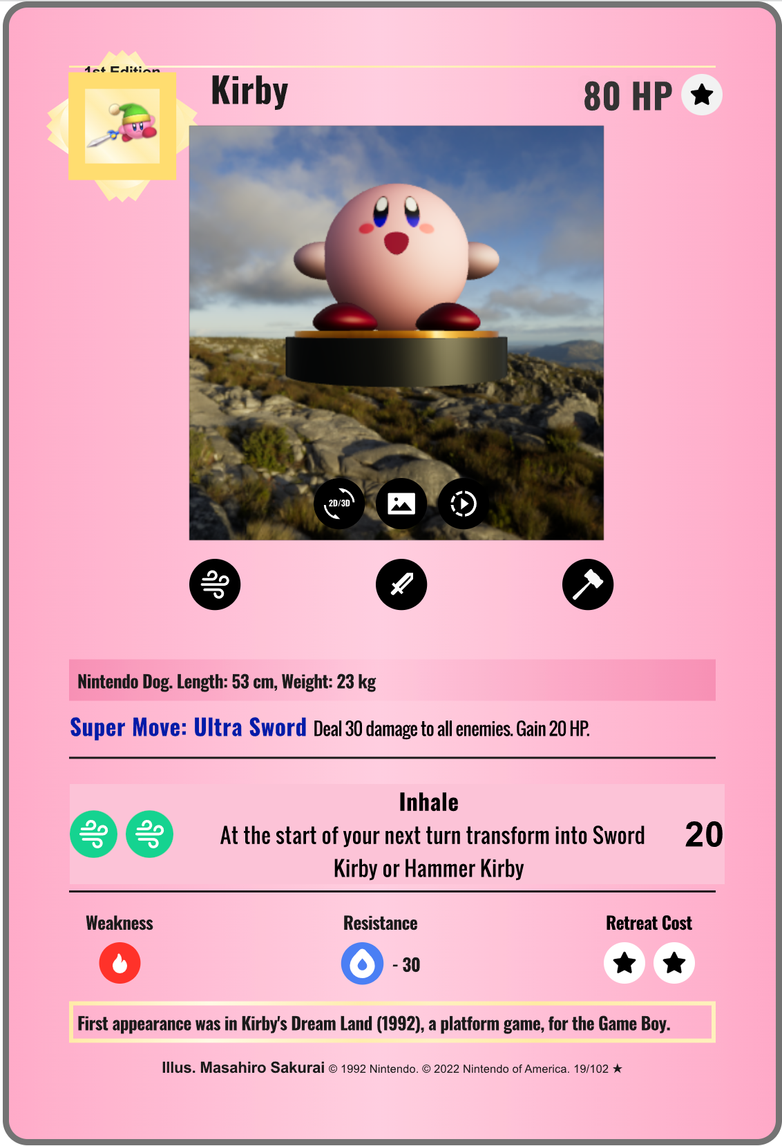
Image on the left shows the card when displaying the 2D version of the model. Image on right shows the card when switched to show the rendered 3D version of the model in an interactive viewport.
The organization of the HTML elements reflects the layout information exported from Figma. To handle any scaling and to maintain visual quality, all text and icons are referenced directly as SVG files as opposed to drawing fonts. Any drawing which was directly to HTML5 canvases correctly handles device DPI in code.
Layering (compositing) of content was achieved using Z or depth offset tagging of elements and transparency blending. Items at the same indentation level have the same depth. The higher indentation level the higher the layer’s Z depth (closeness to the user).
The layering of elements is as follows:
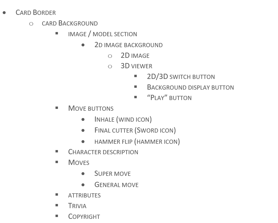
To allow 2D image background toggling, the 2D background and the 2D character image are in separate elements and have different Z depths.
The 2D Image View and 3D Viewer are elements at the same depth but only one is visible at any given time. This is controlled via Javascript associated with the “2D/3D” button.
The viewing buttons are overlayed on top of the 2D and 3D view elements.
The three “move” descriptions are elements at the same depth with only one being visible at any given time. This is controlled via Javascript.
Style Guide
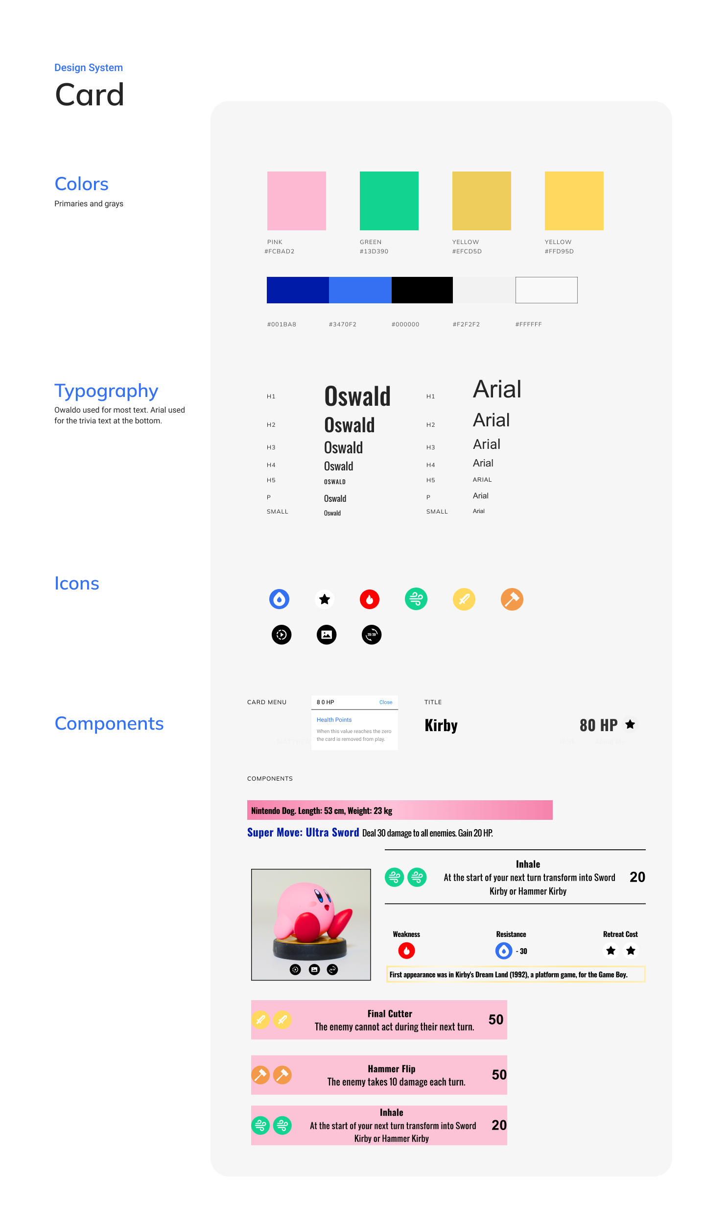
The design style guide was followed by performing straight export of images and vector graphics. CSS was used to style the colors and fonts.
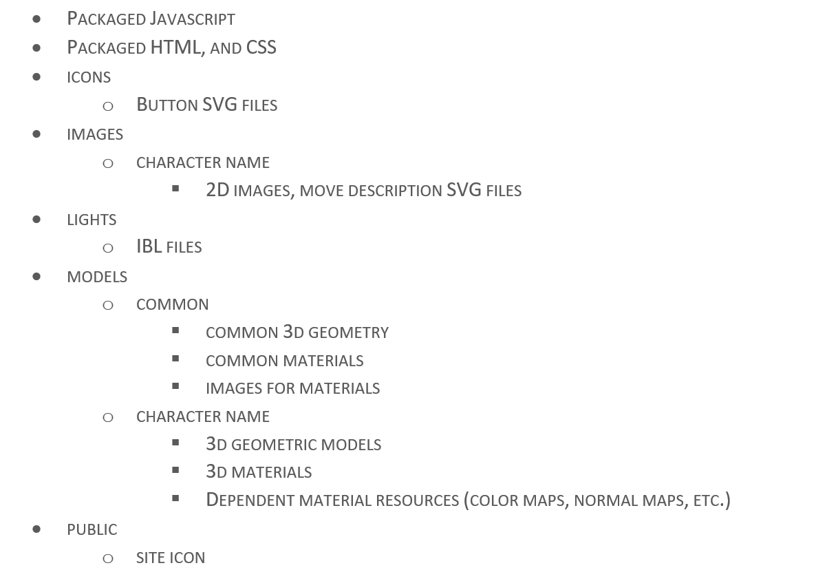
Web Setup / Packaging
There is a package file (package.json) file which is used to install Node.js dependencies as well as create and copy content to a distribution area. The key dependencies are three.js and DAT.GUI for 3D rendering and non-card UI, respectively.
The original content is packaged using webpack to create a distribution which can run on a web site as well as a local server during development and testing.
The distribution is organized is as follows:
3D Viewer
The 3D viewer is a HTML canvas which is initially hidden. The 2D view and 3D viewer’s HTML element visibility is toggled via the 2D/3D button .
The viewer is composed of a “scene” with characters and environments.
The viewer is composed of a “scene” with characters and environments.
Each character has a geometric model, materials, and dependent images.
Each environment is currently only a single IBL (Image based lighting) file which is in rectilinear (latitude / longitude) format.
Any 2D vector graphics have been converted into 3D representations.
Note that as much as possible common or reusable assets are referenced in and not part of a character (e.g., the character platform, IBLs etc.)
The Javascript implementation assumes the distribution folder structure described and accesses all content using relative URI references where “.” Is the root of the distribution.
Characters and Props
The main character assets (image captures, geometry, materials, maps) are separated and loaded in as independent entities from any “props”. For example, the Kirby character is loaded in as an asset and the “sword” and “hammer” “props” are loaded in independently.
This allows for independent placement and visibility control within the viewer and allows for different assets to be shown based on the user selected “move”.
This allows for independent placement and visibility control within the viewer and allows for different assets to be shown based on the user selected “move”.
For example the following assets are collectively changed when the sword button ( )is clicked.
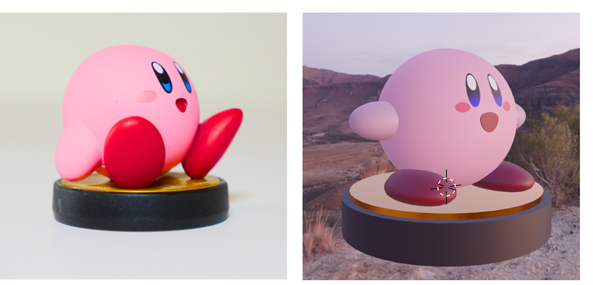
Figure 3: Kirby photograph (left), and Kirby 3d model (right)
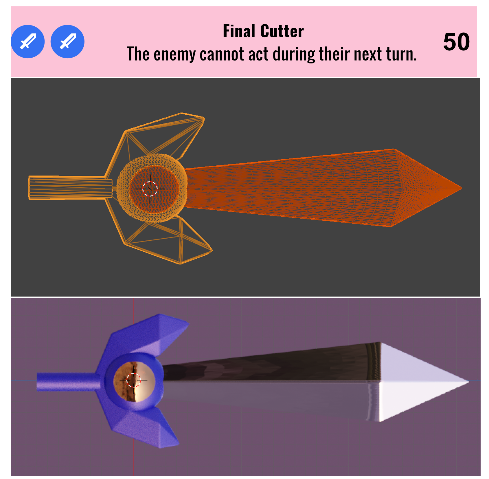
Figure 2: Top: Sword description SVG, Middle: Sword geometry, Bottom: 3 Sword materials (shown on geometry)
Environment / “Background”
When the “background” icon is clicked:
The 2D image background element’s visibility is toggled.
For the 3d viewer the scene background is cleared to be empty. This does not affect the IBL image usage which is required for rendering the scene.
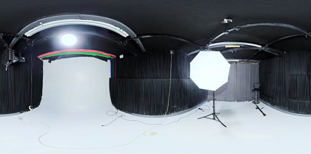
Sample IBL image from here which could be used for lighting.
3D Turntable
When the “play” button is selected: :
In 2D view, the character image used alternates between a single photo of the character and a captured animation loop. GIF animation files were created using Photoshop.
In 3D view, the 3d scene is rotated about the “up” axis by fixed increments. When not playing the increment is not applied. In this view all 3D navigation is still possible.
UI Control
Logic to change 2D HTML element properties such as visibility, source images etc. is written in Javascript. This logic was attached to event listeners for HTML elements to support interactivity.
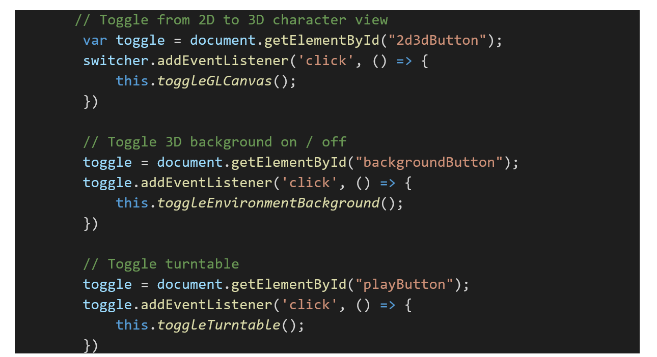
Example button control handling for buttons with identifiers: “2d3dButton”, “backgroundButton” and “playButton”.
“Tooltips” interaction is controlled by adding event listeners for “mouse movement” so that when the user hovers over a given button the tooltip will be set to the custom data “tooltip” string. This data is added to the desired elements as meta-data. This also applies to tooltips for the 2D or 3D viewer elements.
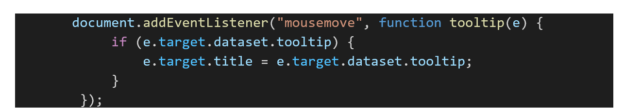
Tooltip handling. Replaces “title” with custom “tooltip” string. Show while mouse is moving over the element.
Help dialogs are displayed when clicking over specific elements such as “HP”, “Special Move” and “Energy”. These toggle the visibility of SVG images which function as “dialogs”.
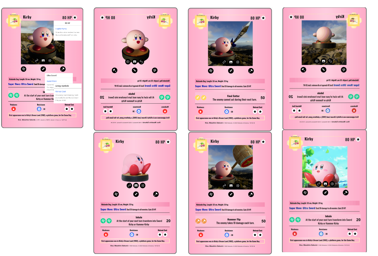
UI logic captures from left to right. 1) Help "dialogs". SVG vector graphics draw drawn as overlays when the associated element is pressed. 2) Background toggle 3D and 2D. 3) Move toggle. 4) Turntable toggle.
Appendix: HTML / Javascript Breakdown
The basic breakdown of Javascript control is shown below. Most of the logic is to manage the 3D viewer with some small parts to control the HTML elements. Logic for controlling options is centralized.