Introduction
The purpose of this project is to present and market a digital collectable card game. These cards are based on classic video game characters and are designed with a retro aesthetic to appeal to those familiar with 80s and 90s culture. To provide lasting value for users’ cards are upgradable in various ways to add additional models, animation, and sound. Cards are also able to be traded and sold within the service.
These digital cards are sold online via our storefront. Cards are sold as a “base” model starting off. This is to encourage consumers to interact with the product in various ways such as writing a review for the product and sharing their impressions on social networks. Over time new cosmetic features will unlock to encourage users to continue using the service.
Digital Card Preview
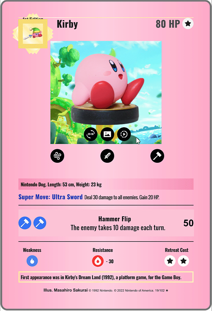
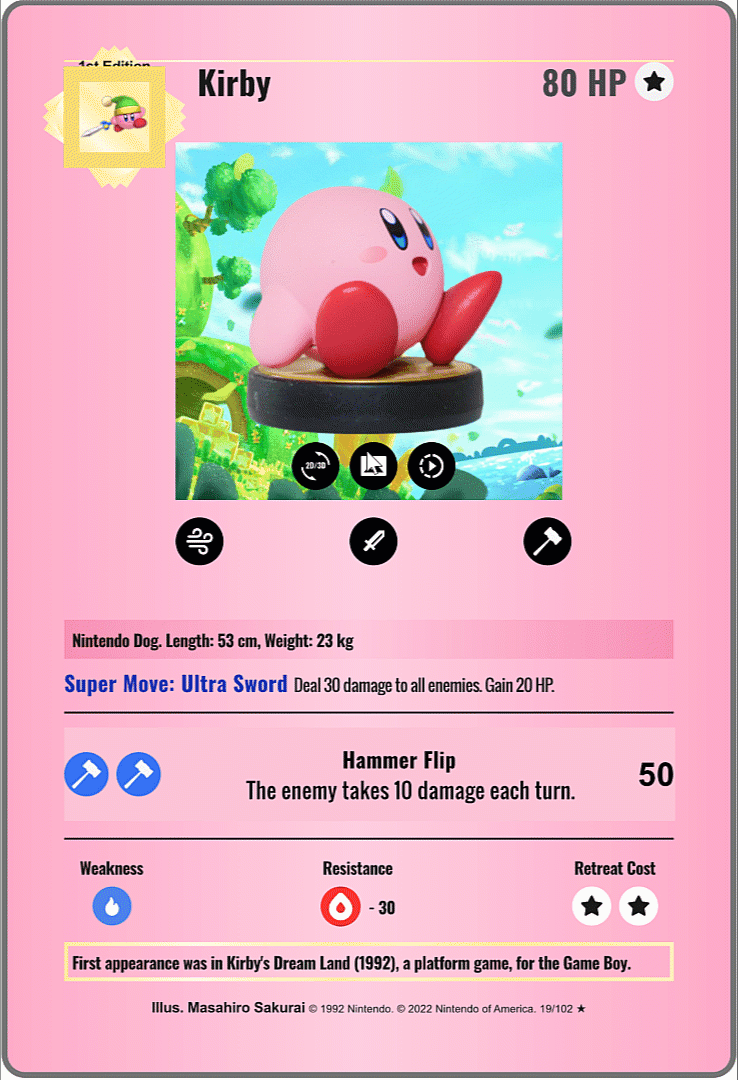
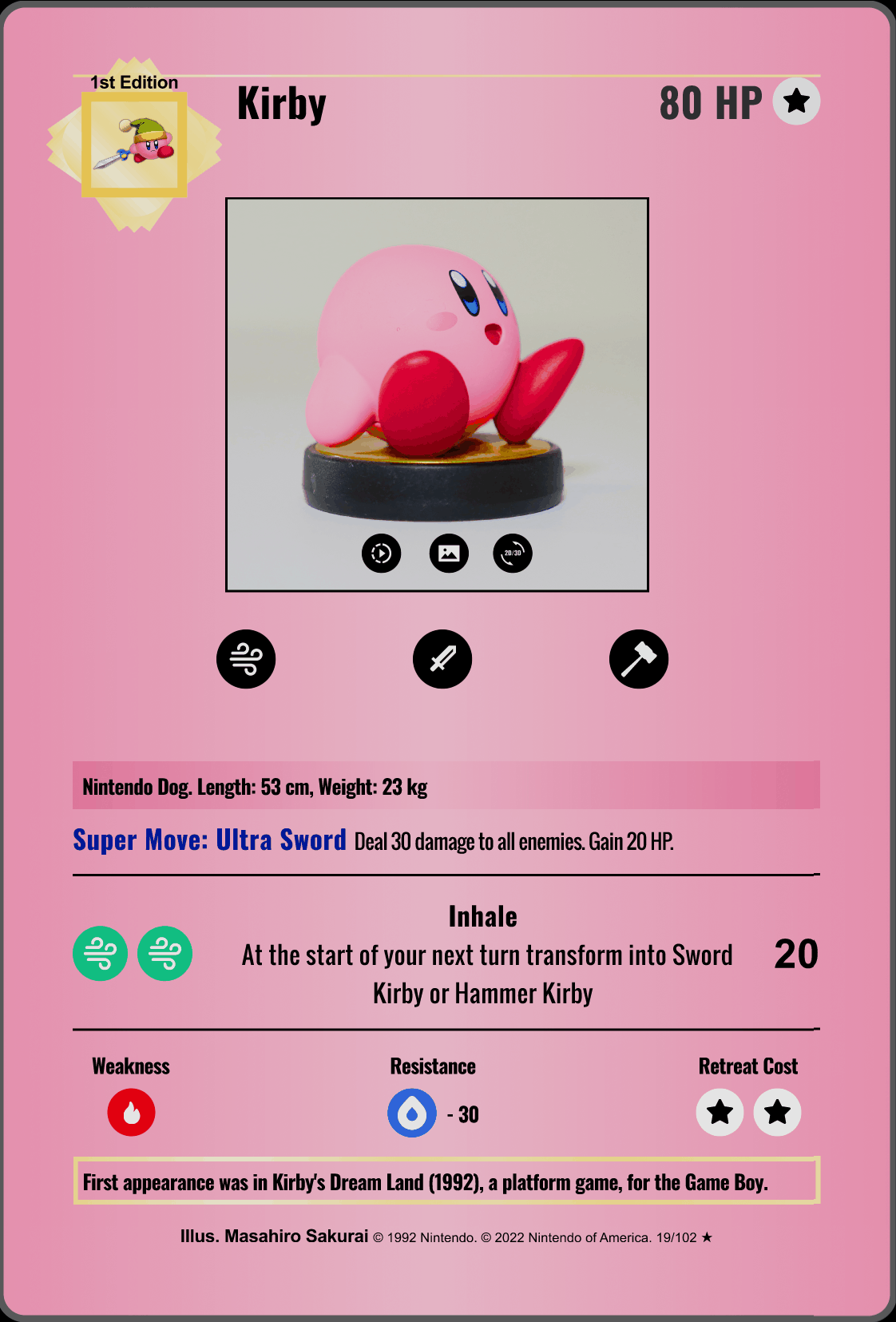
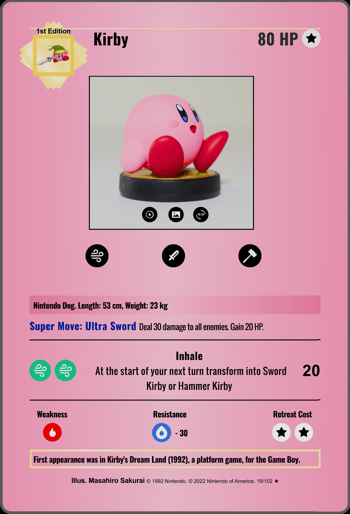
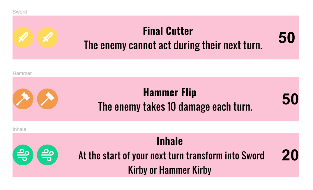
When the icons below the Kirby picture are clicked the corresponding move will change as well.
The 2D background can be toggled on or off.
Toggling from 2D to 3D allows you to see the base model and the model with the sword/hammer depending on if the sword/hammer icon is clicked.
The model can be rotated or scaled and HDR background toggled on or off.
The Figma prototype was used as a base for the digital card. The digital card shows additional features such as a model and prop viewer, looped animations and the ability to toggle or off background.
In comparison to the Figma prototype, the tooltips were modified slightly. Instead of a popup box, users that hover over icons can view a text description of what the icon does.
The card of Kirby uses a basic grid layout with content blocks organized linearly from top to bottom. In the recordings above you can see various move toggles, tooltips and other user interactions.
Graphic Design
The cards are based on classic video game characters and are designed with a retro aesthetic to appeal to those familiar with retro culture. The main inspiration for the card design came from classic Pokémon Cards which utilized simple grid layouts, and flat bold colors and icons. To provide clear imagery which focus is placed on the character illustration as the focal point.
To start off design elements were incorporated from classic Pokémon cards. The elements incorporated included a colored border, large rectangular content blocks, and bold print fonts.
Simplified icons with less layers than the original were created for easier digital viewing. Monochromatic colors and backgrounds were used for the first design. This was done to mimic the feel of the cards and highlight the text. After various iterations a gradient background was added to provide better contrast and add dimension to the card. This gradient background could also be recolored in the future to match the color palette of additional cards.
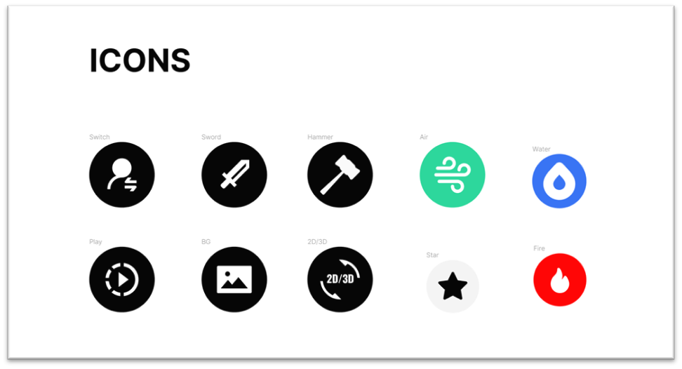
Icons such as the Water, Fire and Air icons are color coded to distinctly represent different element types. Simple, flat vector drawing are used to represent the other icons which can manipulate the image, model or animation of the character section of the card.
UX Design
The other reason for emulating classic cards was to provide a smooth and intuitive user experience. Each content block is organized linearly and reads from top to bottom.
This makes it easy to understand what each part of the card is for such as the description, move and image/model sections. Components were designed using flat design to make it more familiar to users who interact regularly on mobile platforms as well as other digital card games.
Interactable components include buttons that manipulate the visuals of the image/model, props and animation. Flat vector drawings were used to clearly demonstrate functions. For example, pressing the sword icon would add a sword to the base model and change the default move to the sword version.
The main goal with the iconography was for the graphics to be direct and easy to understand. An example of this would be the icon used in the “Weakness” and “Resistance” sections. The “Weakness” icon was color coded red so users would understand that the element represent fire. Similarly, the “Resistance” icon was color coded blue to represent water.
Other components include having various text areas be clickable such as the “HP” section and the “Ability” section. Once clicked these sections would show a tool tip describing the definition of the term. Providing explanations for jargon to users new to card games is an essential part of the onboarding experience.
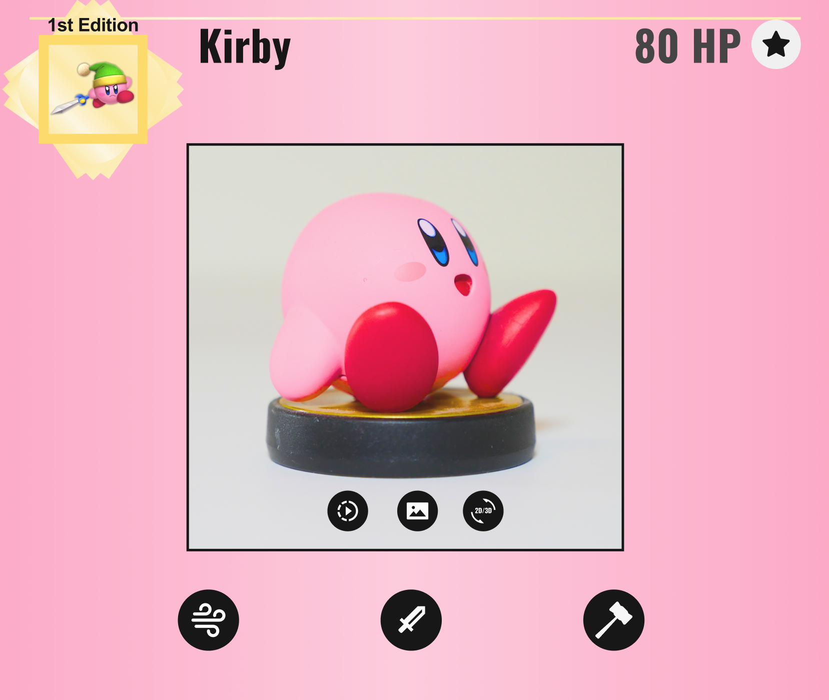
Icons for manipulating the image or model are located directly below the frame. The icons allow you to play a looped animation, change the background, and to switch between the 2D image and 3D model. Clicking the icons below the frame change the moves of Kirby.
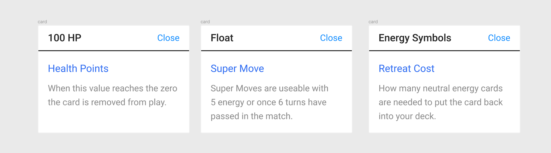
Popup windows provide further information when various text is clicked such as the “100 HP” section, the “Super Move” text or the “Retreat Star Icon”. These windows provide clarity on the card game specific terms that users may not be familiar with.